Hi! Jen Matott here to share a bit more about one of my projects this month. I loved this kit so much for it's colors and theme. The April Kit "Fortune" had my ideas flowing!
What prompted you to pick this take on Fortune?
I immediately thought about being lucky when I heard the word "fortune" but wanted to create a page that showed a different take on it. I was looking up quotes for "luck" or "fortune" and one was "Don't push your luck". Perfect! I was actually dealing with a situation with someone who was not being truthful with me. It's hard when it's someone who you thought you knew well at one time but is bringing drama into your life. I don't have time for people who lie to me or create negative drama in my life. This page was about not pushing your luck with me when I'm done with the mind games! If you are stuck and need inspiration, check out our Inspiration page!
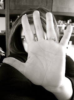
Why did you choose this photo?I had this photo of my hand in front of my face for this page. It was a visual statement and provided me with a space to add "Talk to the hand" on the photo. When someone is annoying me or being difficult, I just want to give them the hand and walk away!
How do you feel about the message of your layout?
It's a statement of frustration when someone is pushing your buttons and making you feel frustrated. I had to tell a former friend that I didn't want to renew our friendship after several years. It was just too draining emotionally with her mind games and drama. I did it for my sanity. It was super hard to be that blunt but it felt right.
What symbolism did you pull into your design?
The photo is the main symbol but the text paper gives it the "talk" imagery.
Tell us a little bit about how you feel now that you have "let it all out" on this page.
I felt good getting this out and it's a fun way to vent my frustration. I love that the kit's theme seems to coincide with my life and what is happening at the time! I never have a problem relating the theme to something personal. I LOVE this page and feel so good about my fun approach to the theme.


1 comment:
Awesome layout and the photo really made the lo!
Post a Comment